Can pharmaceutical marketing be beautiful?
For this RFP, I wanted to move away from lifestyle images of retired couples and instead focus on the stunning beauty of the cells that have enabled recent breakthroughs in medicine.
Concept for Amgen: In life sciences, a treatment is only useful if it reaches people.
To change lives, Amgen’s breakthroughs need to break through to the right audiences.
Writing by Troy Torrison, concept by Mark Chew, visual design by Catherine Mayell.
How can Robinhood persuade people to invest in local businesses that are suffering as a result of the pandemic?
During the initial outbreak of COVID-19, private business owners needed funding to stay in business. Robinhood has created a platform that allows local business owners to get donations and funding through their local communities.
Robinhood tasked me with creating a campaign that would spread awareness of this platform, ultimately connecting local business owners and people willing to invest in these businesses.
I wanted to give the campaign a name that spoke to both audiences. I landed on “local heroes.”
Campaign concept, writing, and design by Catherine Mayell.
Can Accenture build a new agency to replace much of the work currently done by Merck’s 30+ agencies of record?
Agencies are often more interested in winning awards than moving the sales or profit needle. We went at this opportunity with the idea of positioning Accenture as uniquely focused on business results.
The style, story, and design of the piece helped establish our creative abilities. A classic case of “show, don’t tell.” The design was stripped down to the basics to highlight the inversions of the classic tropes of the agency game: awards, high fees, and the bright lights of Madison Avenue.
Writing by Troy Torrison; art direction, logo, and design by Catherine Mayell.
Can we educate our patients about their health while treating them?
Infographics created at Adoptive for the Yale Medicine patient site
UI design for Scholastic Leveled Bookroom
The Leveled Bookroom is a tool to help teachers find books for different reading levels and skill sets.
The Product
Skyfit is a personal trainer app.
Role
• Designed a brand
• Redesigned the profile page user experience and added new features
Skills
• User Interface
• User Experience
• Mobile App
• Branding
• Image Editing
• Wireframing
The Visual Design
The main color references the night sky. A light sky blue is already being used by another fitness app and might have been too obvious of a choice for Skyfit.
The hexagons are a branding element that reference classic gym dumbbells. The fonts are both modern and classic. I added a lot of photography, which is important because we are trying to motivate people to get in shape. Visualization is an essential part of achieving any long-term goal.
Functionality Changes
The mission is to create a personal training experience. Currently there is a lot of focus on audio, which is a strong differentiator, but Skyfit should look to develop other features that will help to achieve this mission such as goal setting and personalized feedback about the longer term trajectory of your workout routine.
The "Progress" Section of the Profile Page
The main profile page opens inside the Progress tab. Looking at a live feed of the profile that regularly updates based on the last workout serves to motivate users to keep coming back and working towards their goals.
Users can customize their profile with a photo and add up to 12 goals.
Users can move from one goal to the next by swiping forward and back or taping the arrows at the top.
The "Past Workouts" Section of the Profile Page
Cameron clicks “Past Workouts” and has the options to view classes This Week, This Month, All, or Favorites. If he chooses one of the first 3 options, he can also see a chart below of how much time he spent working out during that time period.
With this added feature, Cameron gets a bigger picture of his progress that can give him insights into what habits are working for him and what habits are working against him.
The "Discover" Section of the Profile Page
The last tab inside the profile is “Discover.” This is where users get recommendations based on workouts they’ve (a) already taken and “liked” afterwards, and (b) are community favorites. They also have access to a list of workouts they have liked but have not yet taken, which moves them to this list of “Saved by You.”
Cameron clicks inside a recommended class and sees this page. Here he can share the class, read about it, see the difficulty level and play it directly.
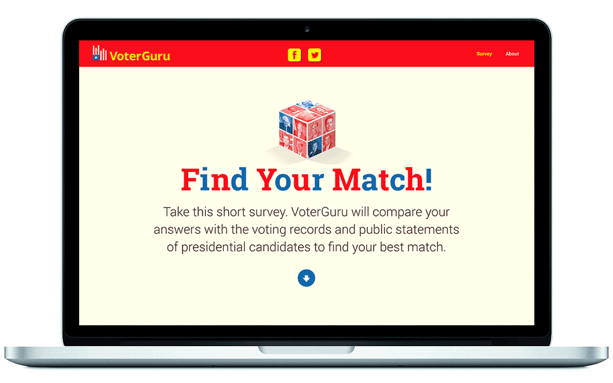
There are 25 candidates for President, who should I vote for?
Could we make answering this question easier if we stole some UX principals from the world of online dating?
The Product
VoterGuru tracks voting records and public statements of political candidates, and compares user inputs with politician records to find the closest ideological match. Additionally, VoterGuru provides resources and tools to help young voters stay engaged in politics.
Contribution
• Designed prototypes and participated in user experience research including observing users, conducting interviews and A/B testing.
• Launched consumer product
• Attracted over 300,000 submissions
• Supported sales with marketing materials including presentation decks, banners, emails and one-pagers.
Role
• Lead brand development and product design
• Conducted usability testing and A/B testing
Skills
• Data visualization
• Branding
• Social media
• Responsive design
• Mobile design
• User experience flows / research
• User interface design
Media
VoterGuru has been written about in publications such as The Observer, Distractify, and Ink.com and recently won an Adweek Project Isaac Award for startup invention.
Product
These are social assets that demonstrate how I would rebrand Austin City Limits Music festival.
Role
• Graphic designer
• Researcher / writer
Skills
• Design for social media
• Mobile design
• Ideation & Sketching
• Image Editing
• Storytelling
• Marketing
• Infographics
Explain the Concept
Music lovers will be attracted to a design that looks fresh, not hackneyed. That being said, the design needs to reference the southern, Texan, context of the festival. Austin is known for its food and ACL has amazing festival food. I added icons such as the cowboy hat, taco, cactus, and ice cream to give the design cultural context.
The color palette is vibrant and all-american which will help banners standout in a cluttered social media feed. The ACL logo is bold, iconic, and simply an acronym asserting that this festival is emerging as one of the most important in the US and transitioning from local “Austin City Limits” to nationally known, “ACL.” The color gradient on the logo and the horizontal background pattern reference sound waves and rays of light.
In terms of the information I chose to include, I wanted to highlight what I learned was unique to ACL Festival. I discovered that the ticket value is very good compared to competing festivals such as Governors Ball and Lollapalooza. As mentioned, ACL also has incredible southern food and access to top chefs in the Austin area. Lastly, I also wanted to let buyers know how quickly tickets were likely to sell out based on previous years.
Product
A vacation loan campaign for Liberty Savings Federal Credit Union created at Prager Creative. This campaign includes posters, magazine ads, direct email, and a takeover.
Role
Graphic designer
Skills
• Design for social media
• Ideation & Sketching
• Image Editing
• Marketing
Explain the Concept
We are trying to sell the idea of vacation so I wanted the ad to appeal to a sense of nostalgia. For the creation of this campaign I used a vintage photograph to create a nostalgic feeling about being on vacation. The styling of the ads is modern and clean to contrast with the old-fashioned photography and bring viewers into the present.
A tri-fold brochure for visitors to the BFI London Film Festival. This festival showcased classic films about space exploration.
The brochure is designed to capture the iconography of these films and celebrate silhouette movie poster tradition.